Foundations are the global rules that ensure every interface built with wA11y is perceivable, operable, and robust by default. By encoding WCAG 2.2 AA standards into these root-level decisions, we “Shift Left”—preventing up to 70% of common accessibility defects before a single component is built.
We prioritize technical intent over visual aesthetics. Our foundations are built on three core operational principles:
Semantic Over Visual
Variables describe function (e.g., surface-error), not appearance (e.g., red-500).
Accessible by Default
Contrast, focus visibility, and legibility are baked into the root values.
Scale Without Rework
Theme or mode changes (Light to Dark) do not require component-level refactoring.
Design Tokens (The Tokens API)
Tokens are the smallest units of the system. They translate accessibility requirements into shared, system-level variables
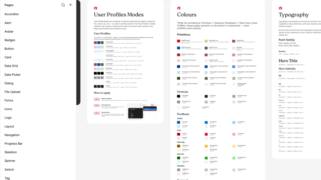
Color Logic
Every color pairing is programmatically tested to meet a minimum 4.5:1 contrast ratio. We utilize an on- token naming convention (e.g., text-on-primary) to automate compliance
Typography Standards
Our scales prioritize rhythm and character differentiation. We implement a 1.5x minimum line-height and specific letter-spacing to support neurodivergent and low-vision users.
Spacing & Targets
All interactive dimensions are derived from a 4px grid to ensure a minimum 44x44px touch target, meeting WCAG 2.2 Pointer Target requirements
Interaction Standards
Standardized behaviors for non-mouse users are enforced at the foundation level:
Visible Focus
A global 3px focus ring standard. We utilize the :focus-visible pseudo-class to ensure high-visibility indicators appear only for keyboard users, maintaining visual polish for mouse users.
Motion Settings
Pre-configured duration scales (100ms–300ms) that respect prefers-reduced-motion system settings to prevent vestibular distress.
Logical Reading Order
Grid and layout foundations are structured to follow a predictable DOM order, ensuring screen reader navigation matches the visual hierarchy.
Deep Dive: System Toolboxes
Downloadable resources to help your team implement the system at scale.
The wA11y Token Spreadsheet
A mapping of all semantic tokens to their corresponding WCAG contrast ratios.


